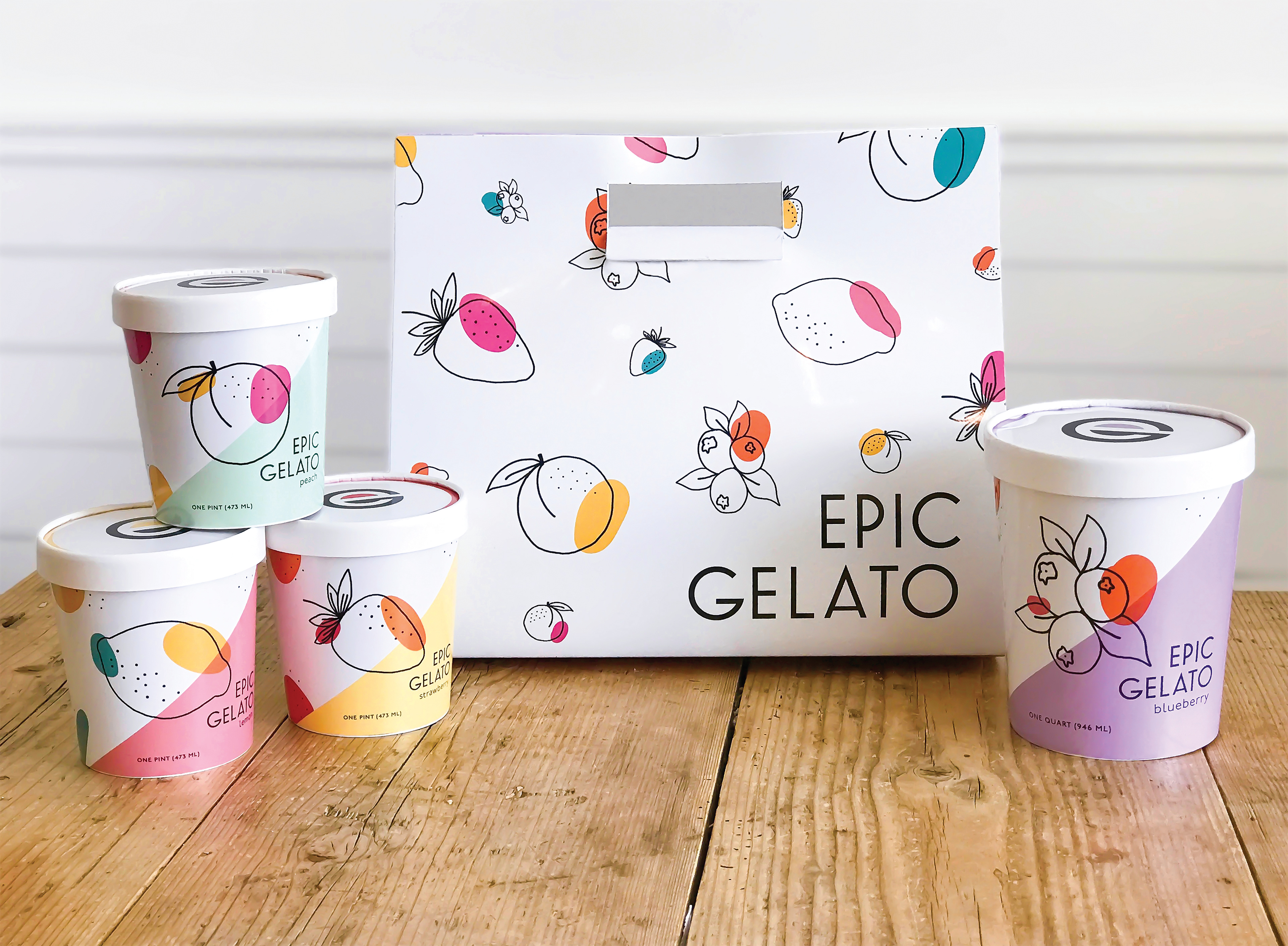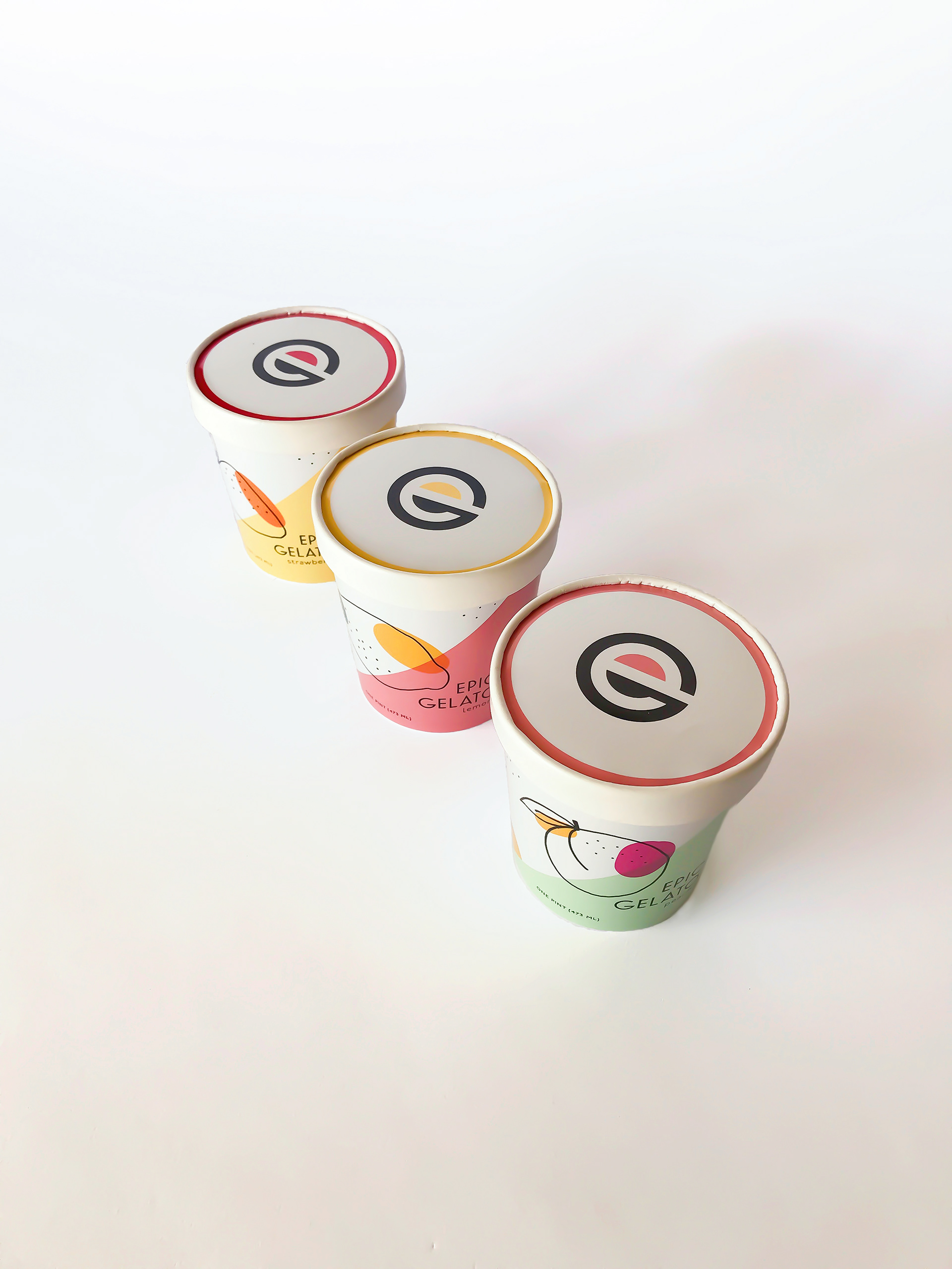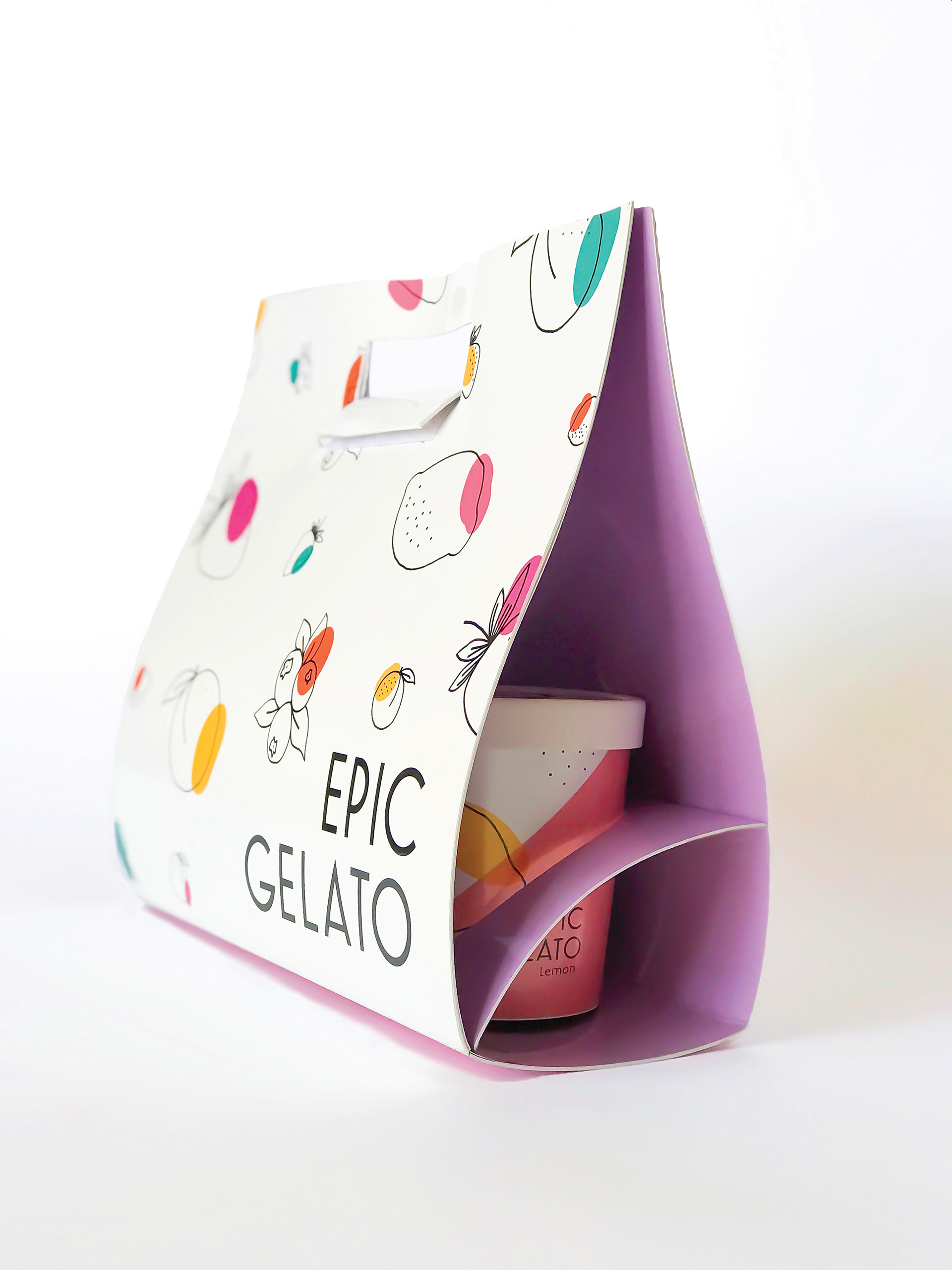


Epic Gelato is a family company founded on freshness and intimacy. It’s environment strives to keep up with a pleasant and family oriented feel that is light hearted and relaxing. Located in the hub of boisterous shops and dining, Epic Gelato has a continuous flow of energy and excitement. Epic Gelato needed a clean logo that didn’t compete with the vibrant colors that were chosen to represent the brand. The cups were designed with a consistent format that changes colors and fruits depending on the flavor while still maintaining the same lively mood for each. The hand drawn fruits signify the hand crafted perfection that went in to designing these flavors. With an almost impossible choice for just one kind of gelato, a carrier was built in mind to take a few more on the road. Epic Gelato’s redesign aspires to reflect these experiences formed in the shop that will leave the customer satisfied and ready for more.
